More Than a Pretty Picture
More Than a Pretty Picture
More Than a Pretty Picture
More Than a Pretty Picture
Packaging
Packaging solutions that help make your product attractive and memorable to your customers.
I provide end-to-end product design services including evaluation of user experience, concept development through production and marketing support. Below are a few samples of packaging I've created for a variety of industries.

Earth Driven
Earth Driven product line was developed for organizations that require recycled oil purchase to meet environmental goals.
The colors reflect the environmental feel, while the art uses a circular motion to emphasize the change to an ultra-clean performance based product.
Blue Blood DEF
Blue Blood DEF was designed to compete in the DEF space with products such as Blue DEF.
The product still needed to be recognizable on the shelf as a CAM2 product, so I brought the racing banner into the bottom of the label. I continued to use this as the common element on all new products as shown below.


Blue Blood Racing Oil
Blue Blood Racing Oils were the champion product for the CAM2 product lines.
My ultimate goal in developing the look of this product was to steal the attention of someone walking by a shelf. I needed the logo to work very hard to gain recognition and that meant over emphasizing it's main feature, the bright red color. So I made it large and turned the logo at an angle to create visual energy.
Blue Blood Premium Lubricants
CAM2 later decided they wanted to add onto the premium Blue Blood product line.
In developing the other Blue Blood products we needed the racing oils to still feel special so I created the new Blue Blood products to carry only the color but not the full look.
I still kept the racing banner as the shelf recognizable element.

To see additional work completed for CAM2 please click to see the Case Study.

Mega Power
Mega Power was an old lubricants line that I redeveloped into a modern feeling brand.
The appeal of the existing logo was the rich gold color and and the curve of the name. I decided to emphasize those things and take it further, making it the shelf recognizable elements. In the brochure, the product lines are easily distinguishable, but stay tight to brand.
CONCEPTS


FINAL
Adare Microcaps
I was asked to redevelop the look of Adare's Microcaps, a package used to sell their taste-masking technology to pharmaceutical clients. At the same time the company itself was going through a full rebrand.
I developed several different concepts that had different appeal. Some are more consumer friendly, while others are more reflective of typical pharmaceutical packaging. They selected the packaging that was more heavily branded in their new color scheme, and a little less consumer driven.
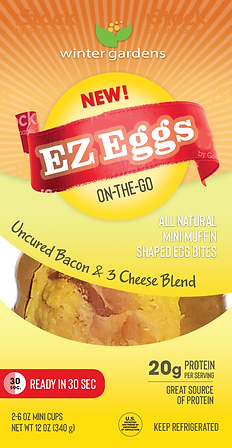
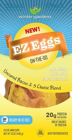
Winter Garden EZ Eggs
Winter Gardens, a wholesale supplier, had the opportunity to sell their egg bites into the convenience store market. I was asked to develop the packaging to hold 2 muffin shaped eggs bites. After evaluating the audience I felt that the product could take on 2 extremely different looks, appealing to 2 different individuals. The first packaging was developed with a natural "Farm-Fresh" feel, utilizing a natural paper. The alternative had a bright, quick "On-the-Go" appeal like many well known breakfast products.

FINAL

CONCEPTS

Abundant Harvest Games
I worked closely with David Esposito to create the award-winning, conversation starter games, Abundant Harvest.
I developed the full visual concept, including all illustration, and worked with US manufacturers to produce the games.
The games are featured on Amazon and have been sold in retail stores across the country.